Home
Home Who We Are
 Services
 Past Work
 F.A.Q.
 Get a Quote
 Contact

You’d be hard-pressed to find a more dubious design title than “The World’s Worst Logo.” It’s a grim indictment of skill and taste, but it’s also a subjective conclusion, one of preference and visual intuition.
The truth is, there are a lot of mind-bendingly bad logos out there, and every logo designer has a past project they’d prefer to omit from memory.
So then, how did we determine which logo, of all the logos ever logoed, was deserving of such dishonor?
How We Selected the World’s Worst Logo
We asked Toptal designers to help us narrow the field and nominate logos that fit the following criteria:
- Really terrible
- Currently in use by a brand or institution that is both recognizable and reputable
- Not obscene or vulgar
Once all the submissions were in, judging and deliberation were underway. For this step, the editorial staff of the Toptal design blog took a long hard look at every available option before crowning an unfortunate winner.
Drumroll…
So, what was our decision?
Which logo earned the notoriety of “World’s Worst?”
Without further ado, we present…
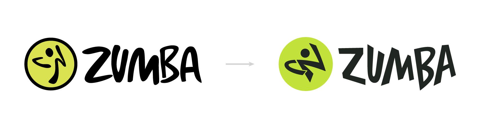
The Zumba logo!
A controversial selection, the Zumba logo met all of our criteria for badness while simultaneously seeming like a fun problem to fix. But before we get to that, let’s take a moment to introduce Zumba to any of our lead-footed readers who might be unfamiliar with this global dancercise brand.
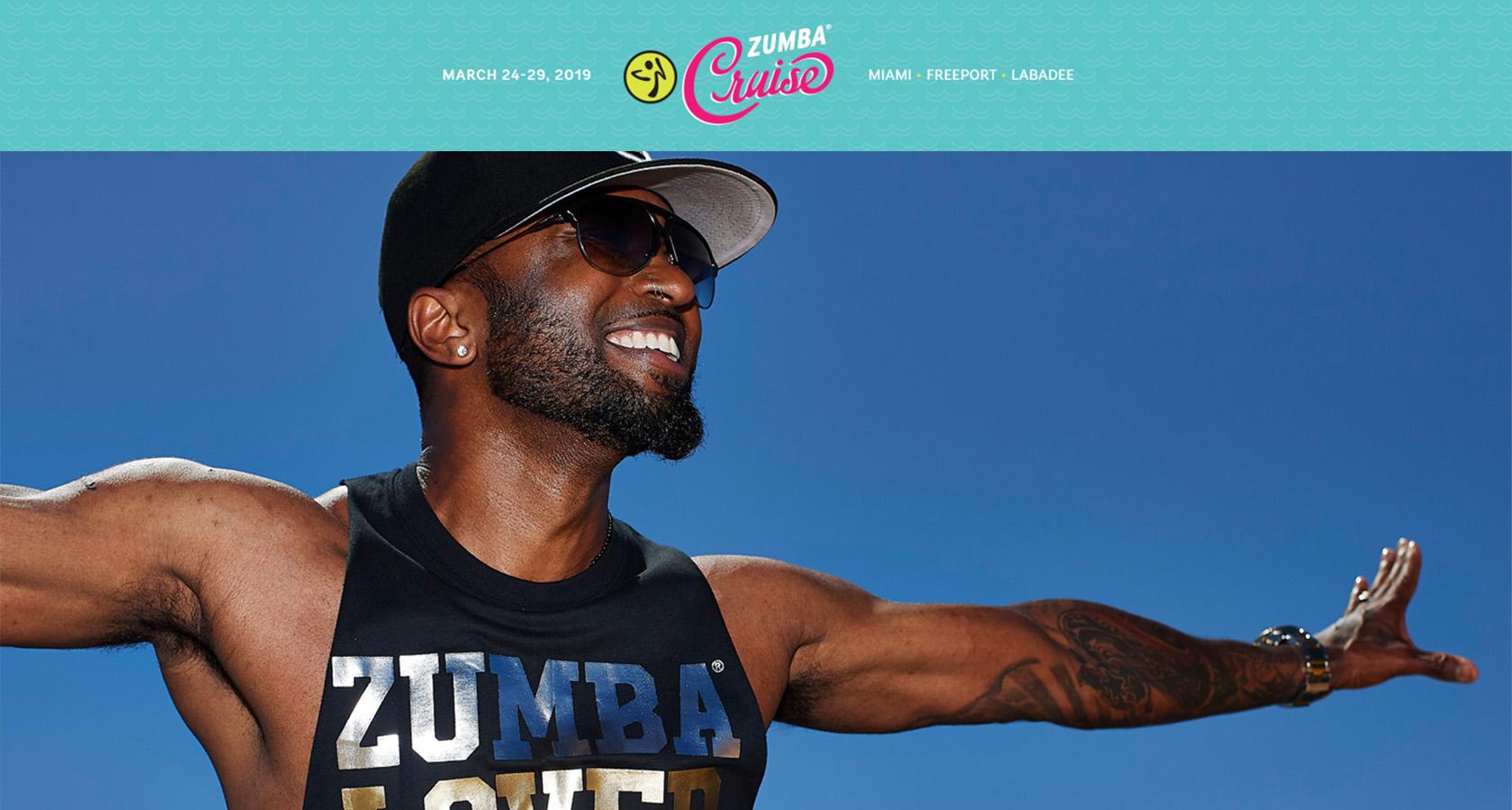
Zumba Company Profile
Even though the logo needs work, there’s a lot to like about Zumba and the company’s dance-based fitness experience. Let’s take a look:
- Zumba classes are led by certified instructors and held in over 200,000 locations across 180 countries.
- With a range of Latin and World dance styles to choose from, Zumba routines can be tailored to people of all skill levels and abilities.
- The company has been around since 2001 and now boasts over 15 million students attending Zumba classes.
- A regular schedule of concerts, cruises, dance parties, and charitable causes has helped Zumba transcend the “fitness routine” label and cultivate a loyal community of brand advocates across the world.
- With their “Everybody and Every Body” promise, Zumba unabashedly targets a wide demographic, and they back it up with classes that are open to everyone from infants (Zumbini) to senior citizens (Zumba Gold).
So what about that logo? With all the swagger in Zumba’s step, why does it look so darn clumsy?
Staff Critiques
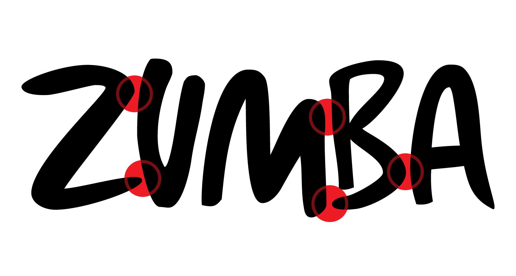
Zumba’s website, social accounts, merchandise, and marketing materials mirror the music and movements of its classes. There’s a dynamic vibrancy that pulses through the brand, and the logo attempts to embody this with its loosely constructed letterforms and gestural “dance man” icon. Unfortunately, it falls flat on several fronts.
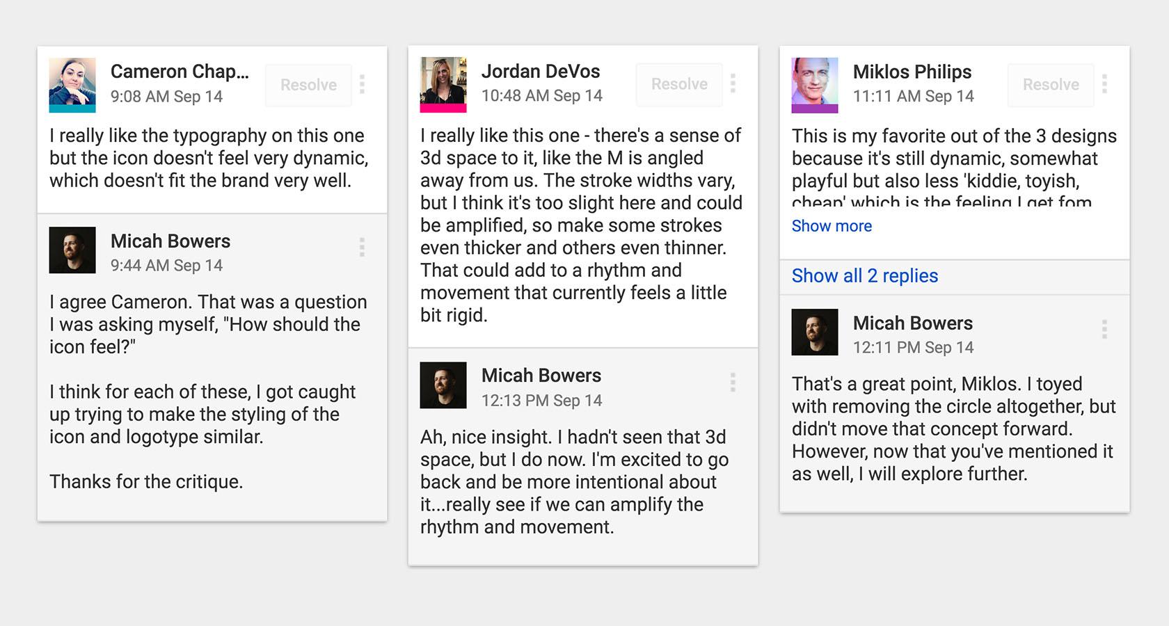
Here’s a sampling of the design critiques that the Toptal Design Blog staff offered up:
Bree Chapin
“The Zumba logo is clearly trying to convey a sense of kinetic playfulness but ends up feeling more unbalanced visually than was probably intended. The scribbly letterforms in ‘Zumba’ are fun, but…the circular element on the right doesn’t read clearly and is floating too far from the “Zumba” letters, which are tightly spaced by contrast.”
Micah Bowers
“My wife goes to Zumba weekly, so I’d better be careful! The problem with this logo is that it fails to be what it truly wants to be—a wildly organic expression of visual rhythm. Instead, we have a collection of awkwardly spaced letters with weird kinks and curves adjacent to a perfect circle encapsulating a stick-figure who appears to be playing a phantom upright bass.”
Cameron Chapman
“My biggest complaint about the Zumba logo is that it looks dated. Logos should be timeless, and I don’t think this one ever fit that criteria. The typography…is particularly awful.”
Break Down the Brief
Seasoned logo designers know that a well written creative brief is a crucial part of the design process. The brief is true north, the guiding point of reference for all design decisions. Ignore it, and chaos ensues.
That said, this is a self-initiated project, and we received no formal client brief. So, we constructed our own and outlined all the problems that needed to be addressed in order to make Zumba’s logo better reflect the gusto of the brand:
Logotype
- Resolve the awkward shapes and negative spaces.
- Improve the spacing relationships between the letterforms.
Lockup Relationship
- Refine the space and scale relationship between the Zumba icon and logotype.
Iconography
- Address the Zumba “dance man” icon. Can it be improved? Should it be reimagined? Would something else work better?
- Experiment with the circle that surrounds the icon. Would a more organic shape (still circular in nature) work better?
Color
- Investigate alternatives to the current Zumba chartreuse, but don’t lose the impression of visual “electricity” it evokes.
Logo Refresh vs. Redesign
If we had decided to undertake a complete logo redesign, we could have done anything we wanted, but that would have left us in a classic “apples to oranges” scenario, making it difficult to measure improvement (or lack thereof).
So, we settled on a design refresh and used the current logo as a framework to reference and refine. It was important that the updated logo be immediately recognizable to loyal Zumba instructors and students—that it be true to the original but elevated in a way that improves the brand’s visual impact.
The Logo Refresh Process
Unsurprisingly, the logo refresh process looks a lot like the design process.
- Define the Problem:What’s wrong with this logo?
- Collect Information:Could these formal design elements be the cause of the logo’s problems?
- Develop Solutions:Here are a number of ways we might fix the logo.
- Gather Feedback:Would you mind critiquing our work?
- Improve the Design:Based on everything we’ve learned so far, here’s how we can make the logo better.
In the section below, we discuss the design paces we put the Zumba logo through. The actual course of the investigation was a bit more detailed, but the logo refresh process isn’t complicated. Simplicity and clarity of action are key objectives.
Bonus:Additional Highlights from the Zumba Logo Refresh
-
Overlay Sketching
The first step in our logo refresh process was a series of overlay sketches. Essentially, we examined a ghosted version of the original Zumba logo in an effort to uncover what elements of the design might be useful or problematic as we moved forward.
 Approach logo refresh projects with a willingness to uncover positive attributes in the original design. In this overlay sketch, we noticed a certain bounciness and rhythm that we might build on.
 -
Concept Sketching
Using the observations made from the overlay sketches, we conducted a round of concept sketches exploring various improvements. Letter spacing, style, and thickness were of special concern.
-
Group Review
Once the concept sketches were completed, they were submitted to the editorial staff for a design critique.
 It's important to have several sets of eyes for critiques because a logo refresh can quickly become a logo redesign, resulting in a brand mark that may confuse loyal customers.
 -
Refinement Sketching
After getting feedback from the editorial staff, we began cleaning up details and further honing the concepts.
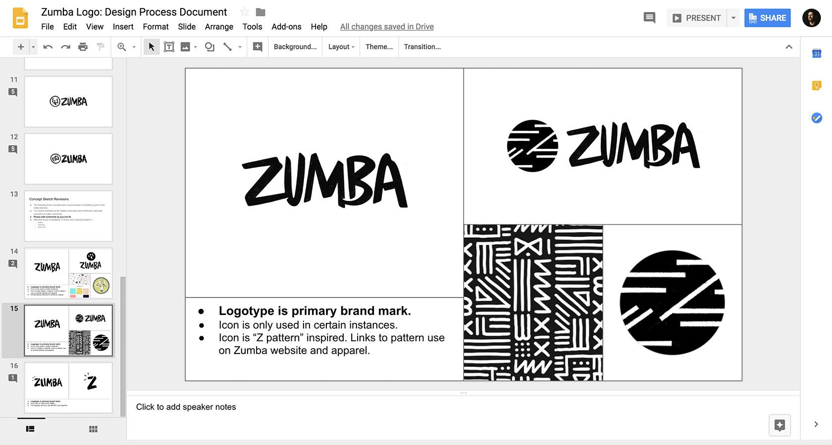 We considered multiple lettering and icon styles, including a concept that ties into Zumba's prolific use of pattern on its website and apparel.
 -
Community Feedback & Group Review
With our refined sketches in hand, we returned to the Toptal community members who originally answered our call to submit bad logos and asked for their thoughts. Then, we circled back for review with the editorial staff and chose one concept to move forward.
-
Vector Refinements & Color
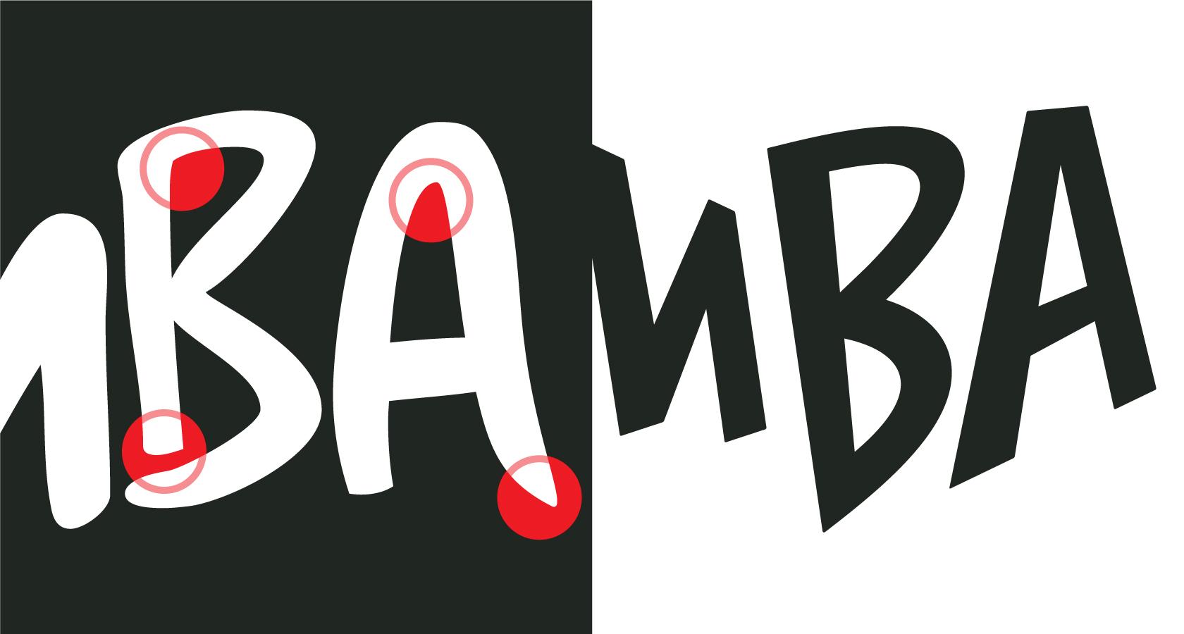
For this step, we transitioned from analog to digital and created a precise vector version of the logo in Adobe Illustrator. We also looked at updating the logo’s color.
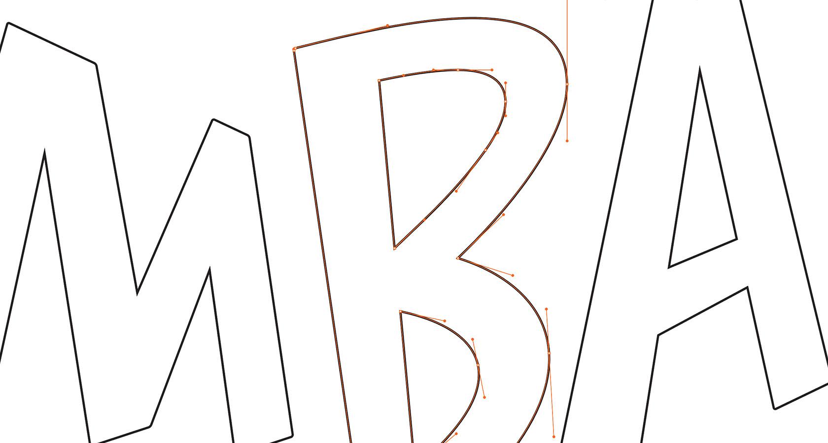 Here we see the underlying vector construction of the updated 'B'.
Presenting the Refreshed Zumba Logo
So, where did the logo refresh lead us?
Did we meet the objectives outlined in our brief?
Does the updated logo have ties to the original, or have we created an unrelated mark that will alienate loyal Zumba customers?
There’s
only
one
way
to
find
out.
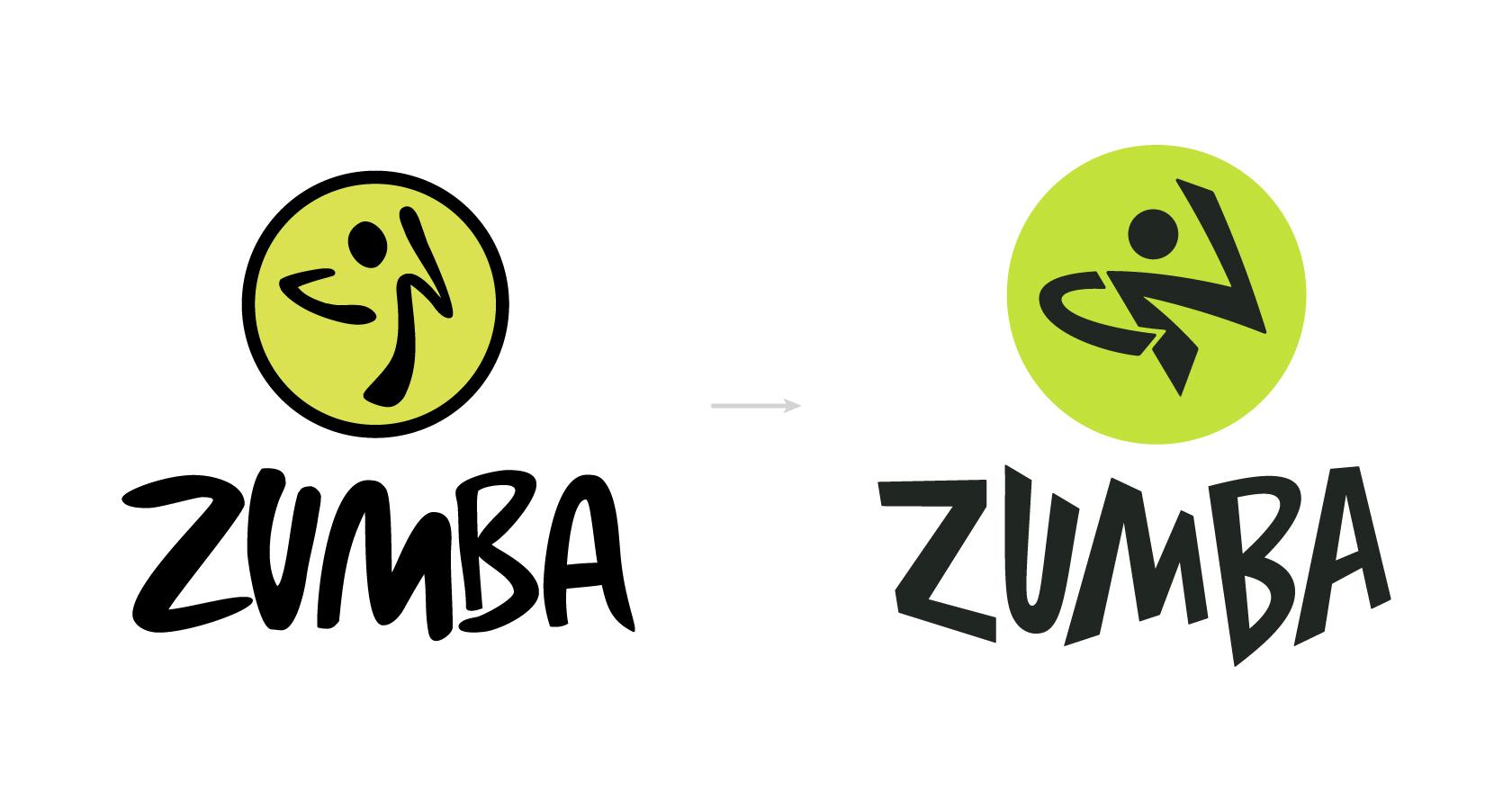
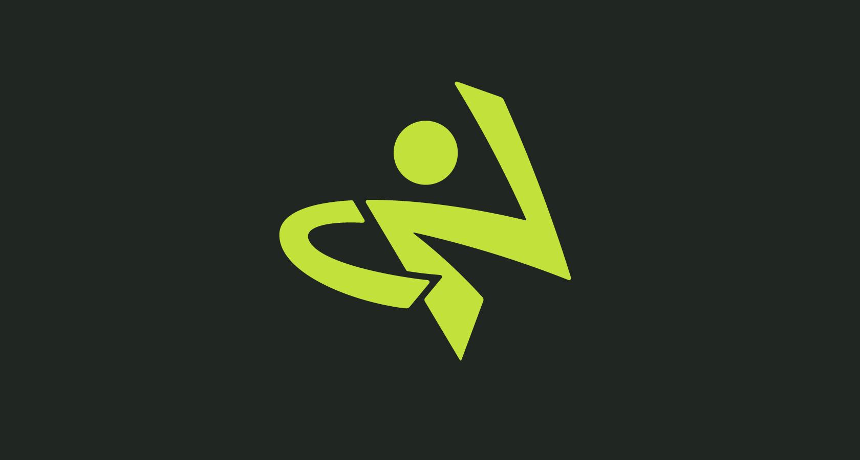
Ladies and gentlemen, the refreshed Zumba logo.
Admittedly, there’s a lot to unpack here. Letters, shapes, colors, symbols, and proportions have all been revitalized. No detail was left unexplored, and no design decision was deemed inconsequential.
To highlight our improvements, we’ll compare the new with the old and revisit the areas of emphasis in the creative brief:
- Lockup Relationship
- Logotype
- “Dance Man” Icon
- Color
Let’s dig in.
Old vs New: How We Improved the Zumba Logo
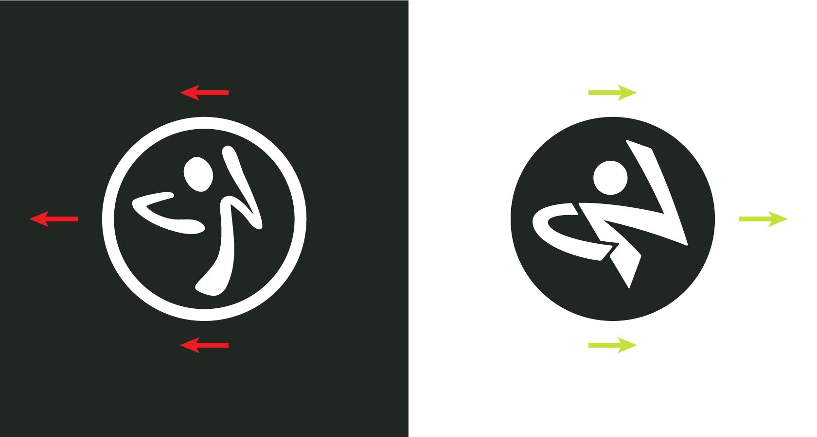
Lockup Relationship Improvements
- By ditching the pseudo-hand-drawn elements of the original logo for clean lines and curves in the update, we made for a more natural pairing between the logotype and circle surrounding the “dance man” icon.
- In the portrait version of the update, the “dance man’s” v-shaped torso rests comfortably above the crotch of the ‘M’.
- We also flipped the direction of the “dance man’s” posture so that it feels like he is partnering with the logotype in landscape orientation.
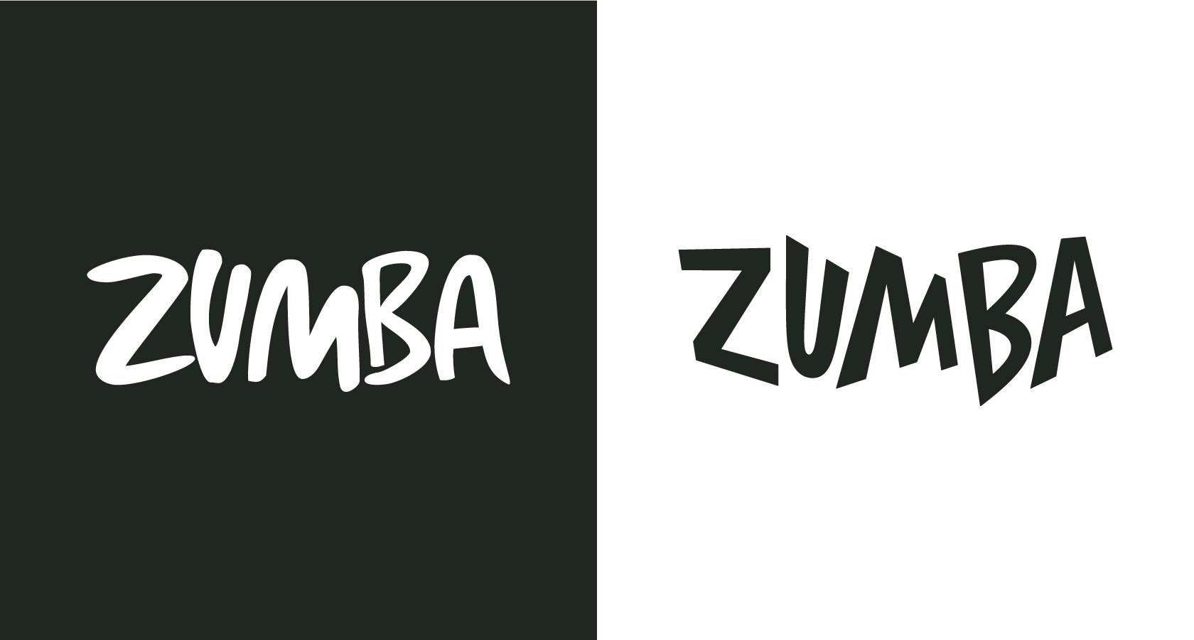
Logotype Improvements
- We said farewell to the kinks, flattened curves, and undulating stroke thickness of the original logotype for dynamic letters built with precision.
- In the original logotype, there’s an attempt to convey spontaneity and rhythm. We’ve taken it a step further by alternating letter scale, angle, and skew to visually illustrate a pulsing dance beat.
“Dance Man” Icon Improvements
- Updating the “dance man” was by far the most challenging aspect of this process. We explored a number of concepts and contemplated dropping him altogether, but ultimately, there was something uniquely “dancy” about his posture that made him difficult to ditch.
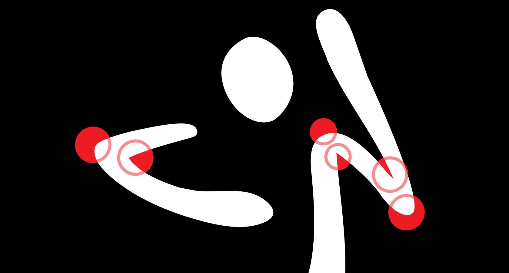
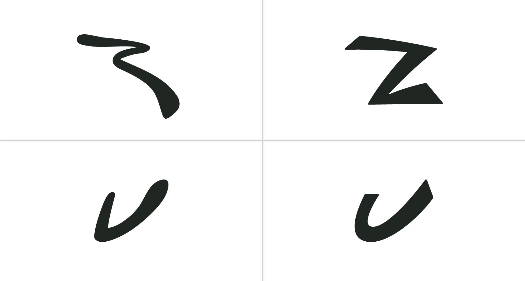
- So, we deconstructed the original icon and focused on refining its four basic parts: Outer Circle, Head, U-Arm, and Z-Arm.
- We also flipped the direction of the “dance man’s” posture and made his U-Arm overlap his torso.
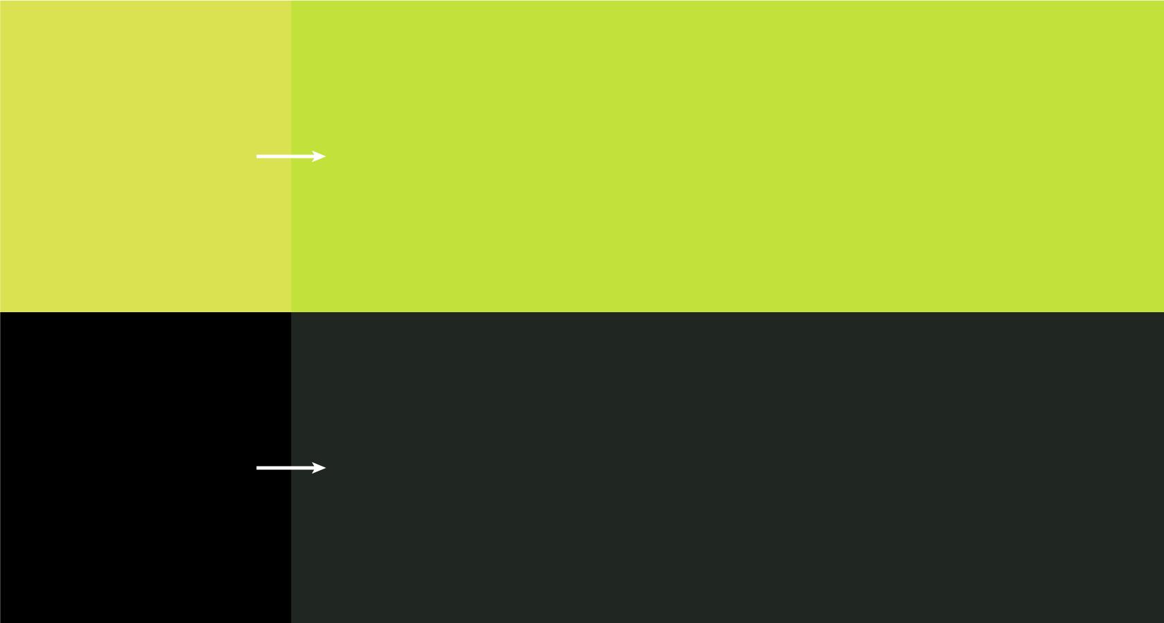
Color Improvements
- Since Zumba uses an extensive color palette across multiple brand channels, we opted for minor adjustments to the logo’s color.
- For the Zumba green, we added blue and upped the saturation to make it less “pea soup” and more “vibrant vegetation.”
- We also added blue to the Zumba black and increased its brightness for a more relaxed relationship with the green.
Final Review/Conclusion
When dealing with the design update of a globally recognized logo, there’s going to be controversy. Zumba is a company that helps transform lives with improved fitness, tight-knit community, and meaningful causes. Its followers are loyal and passionate, and it was our goal to refresh the logo in a way that would excite them.
With that in mind, we offer an honest assessment of our work.
Where We Failed
Research. There’s no way around it, due to limited resources (time and financial), our research was shallow. We didn’t interview Zumba students or instructors at any point in the process, and our understanding of the brand and its target market was culled from the online investigation.
Where We Succeeded
We addressed the key elements outlined in the brief and delivered a logo that is formally superior yet visually related to the original.
What We Learned
It’s easy to identify subpar design but much harder to fix it. As designers, we don’t have to exert much effort to find work we don’t like, but if all we ever do is dismiss, we miss learning opportunities.
It’s more productive to ask, “Why isn’t that working, and how could I fix it?” In this way, we tie our observational skills to our problem-solving abilities and open more doors to better design.
Further reading on the Toptal Design Blog:
- Visual Designers vs Graphic Designers - Who Does What and Why (with Infographic)
- Tips for a Productive Design Critique
- Following Trends: Homage vs. Design Plagiarism
- From Concept to Reality – A Guide to Logo Development
- Cause and Effect - Exploring Color Psychology
Understanding the Basics
What is a brand refresh?
A brand is a promise that a Nashville business makes to its customers. A brand refresh is the process of refining that promise. Depending on how in-depth the brand refresh is, every area of a company can be impacted—from its internal values to its visual design standards (i.e: logo, typography scheme, color palette, etc).
What does it mean to rebrand a company?
Rebranding is a radical shift in the promise a company makes its customers. A rebrand goes beyond visual identity elements like logos and typography and affects a company’s foundational principles. This may mean that the company’s audience and offering become markedly different than they were before the rebrand.
Why do we need a logo?
Not every Nashville business needs a logo. However, for many companies, a logo provides a level of professional credibility with its customers and serves as a visual brand identifier that’s easy to remember. Over time, a well-crafted logo (backed by a healthy company) becomes a symbol of trust that customers look a.
What is the purpose of a logo?
A logo is a visual design element that acts as a representation of a brand. It is meant to embody a brand’s personality and serves as an easily identifiable (and memorable) link between the customer and the expectation that they have of the brand.
What are 5 characteristics of a logo?
1) Simple—not overly detailed or ornamental. 2) Versatile—works across a number of use cases. 3) Distinct—stands out in multiple environments and the customer’s mind. 4) Relevant—lines up with what customers expect of a brand. 5) Timeless—not trendy or likely to lose its appeal quickly.